CREATIVE DIRECTION
BRAND DESIGN
GRAPHIC DESIGN
UX DESIGN
UI DESIGN
BRIEF
A bike and mobility store built around the green transition — part shop, part mobility centre, extended by an app that tracks routes and shows the CO₂ each ride saves.
Task. One visual identity, holding across print, in-store and digital.
Idea. GreenMove sells belonging, not bikes. The identity borrows the visual language of political mobilisation — agitprop posters, mass-movement slogans — to frame cycling as collective action rather than private virtue.
Delivered. Logo, campaign poster, flyer, app UI, social campaign — five surfaces, five days.
Logo
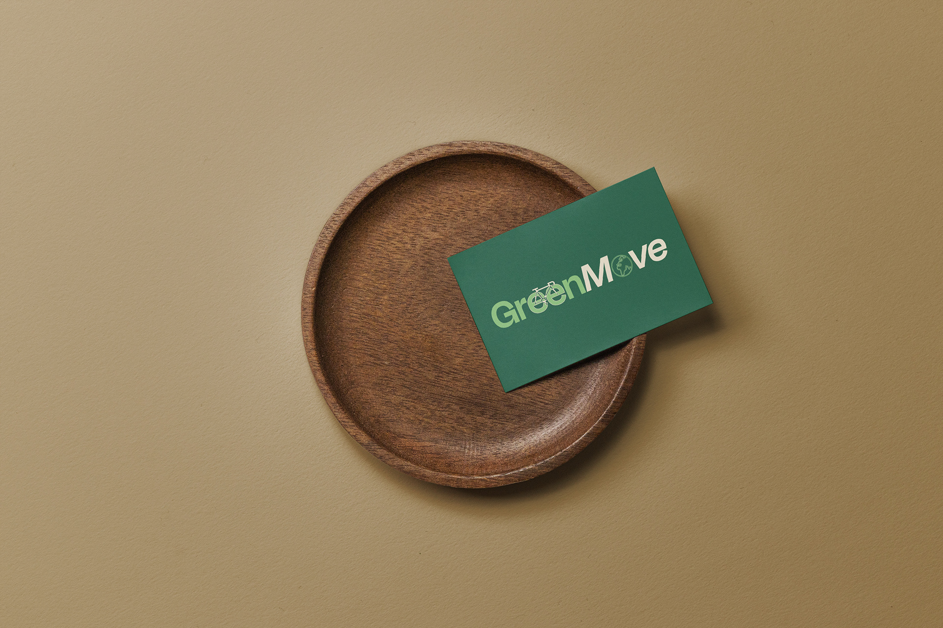
The double E in green becomes bicycle wheels; the O becomes a planet. Set in Degular Display SemiBold with MOVE in italic, outlined to vector so the illustrations could be cut directly into the letterforms. Movement and sustainability in one mark, no extra elements.

Campaign poster
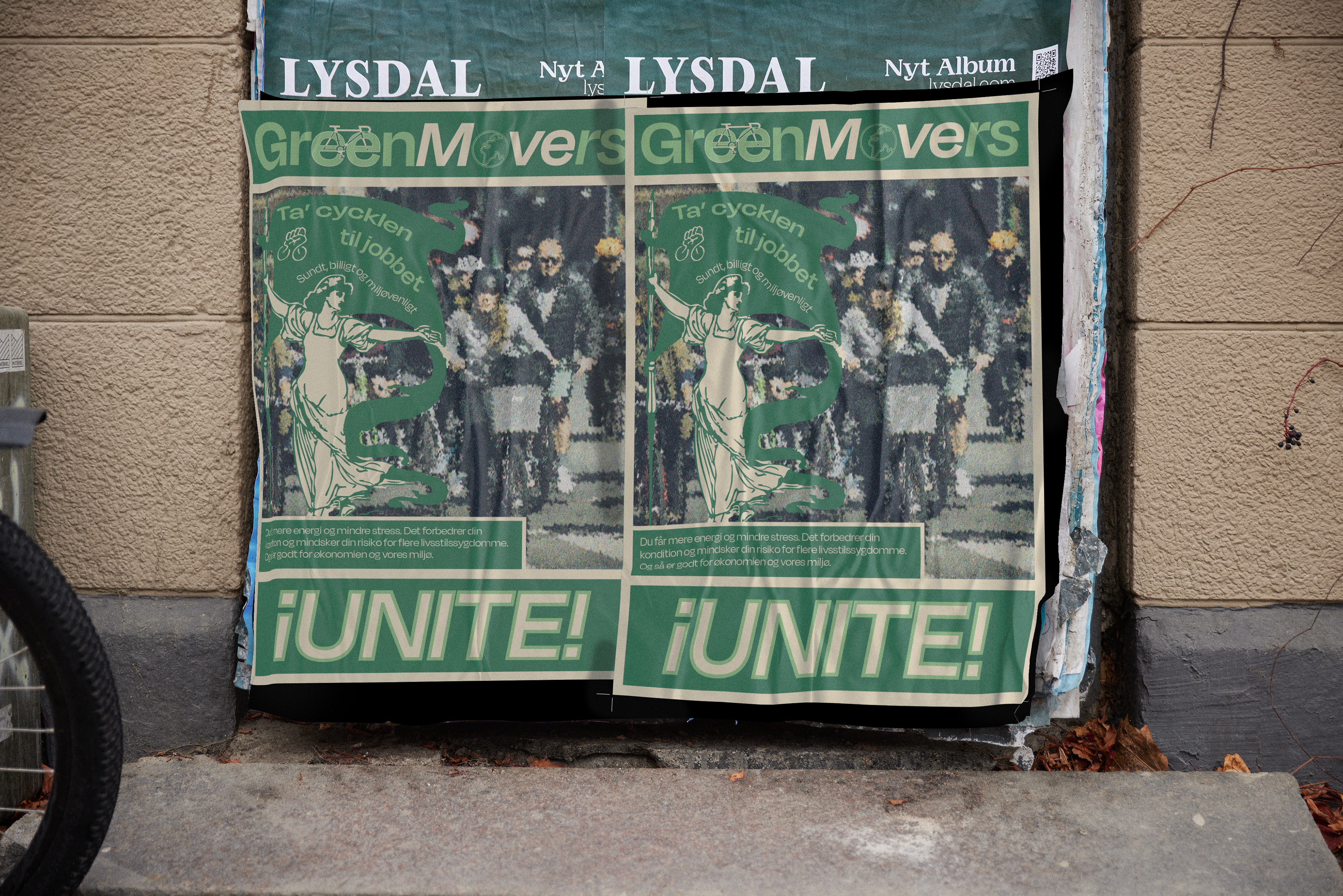
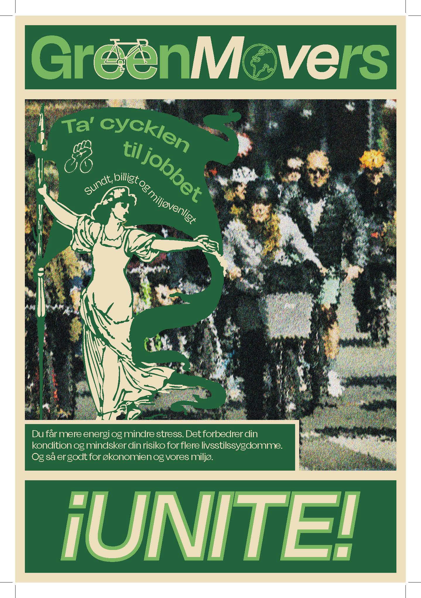
GREENMOVERS UNITE! — a turn on workers of the world, unite. The photograph is pushed to texture and abstraction so no individual is identifiable: the poster addresses a movement, not a person. Inverted Spanish exclamation for warmth, so the call to action stays playful rather than doctrinaire.
App UI
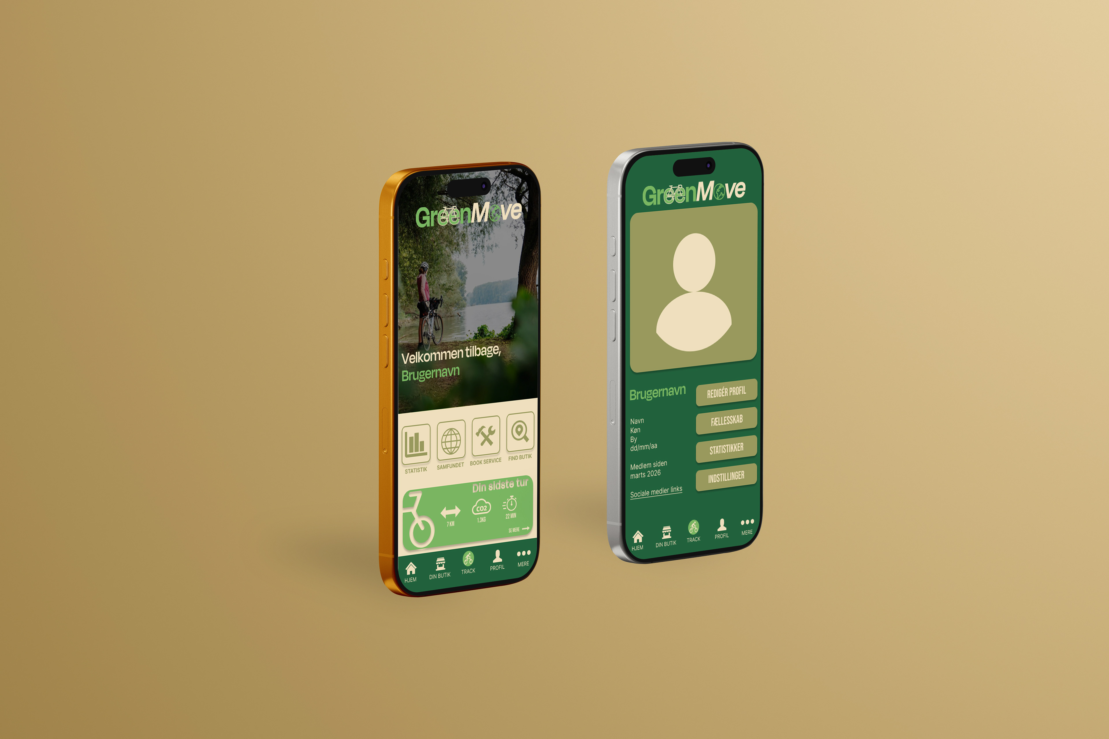
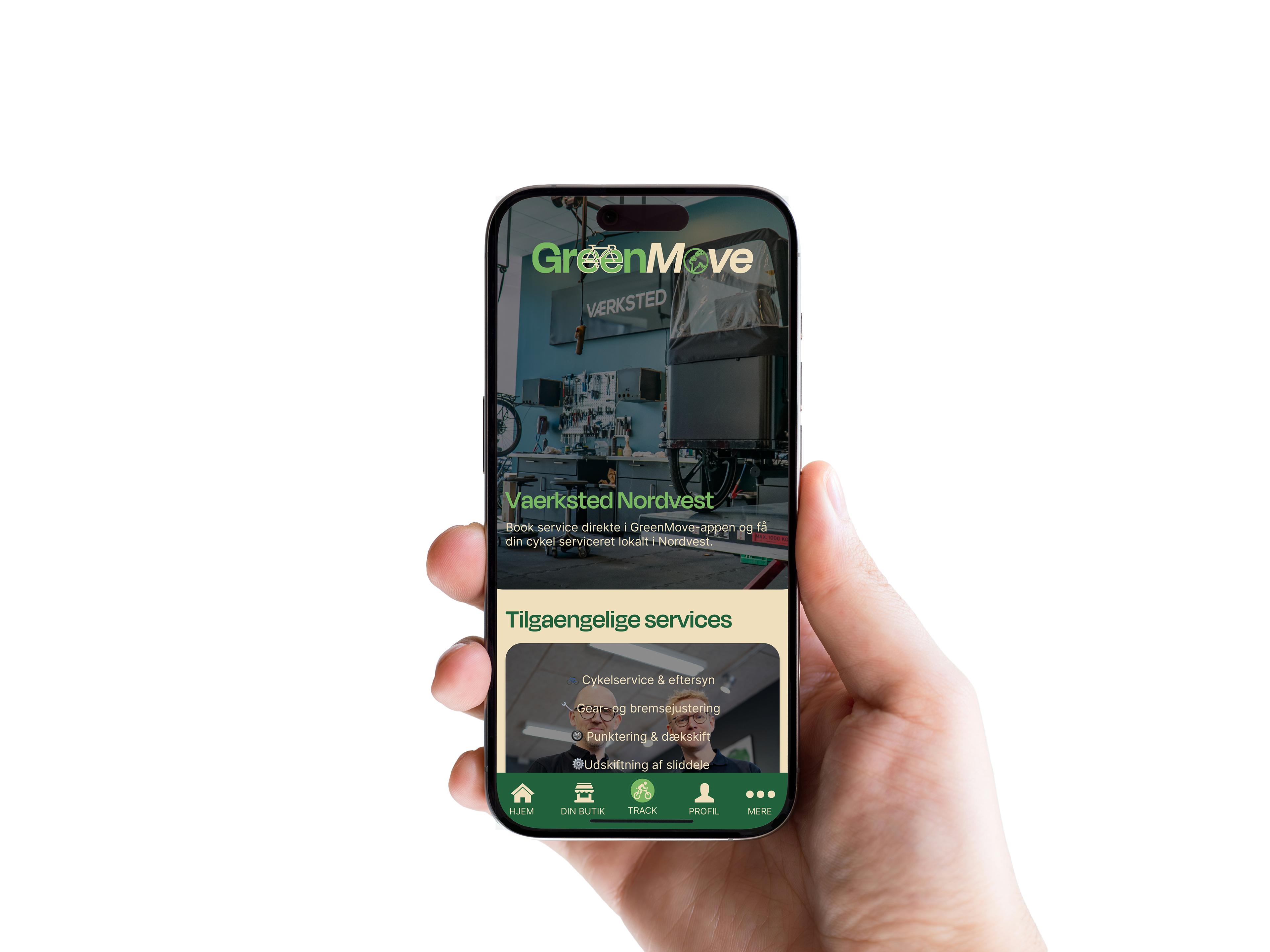
Three screens — home, profile, store. Same palette and type as print, with Bebas Neue added for buttons where hierarchy has to carry navigation. Where the poster argues for the collective, the app makes it personal: friends' activity, shared badges, a named advisor you can reach directly. The community made individual.
Brochure
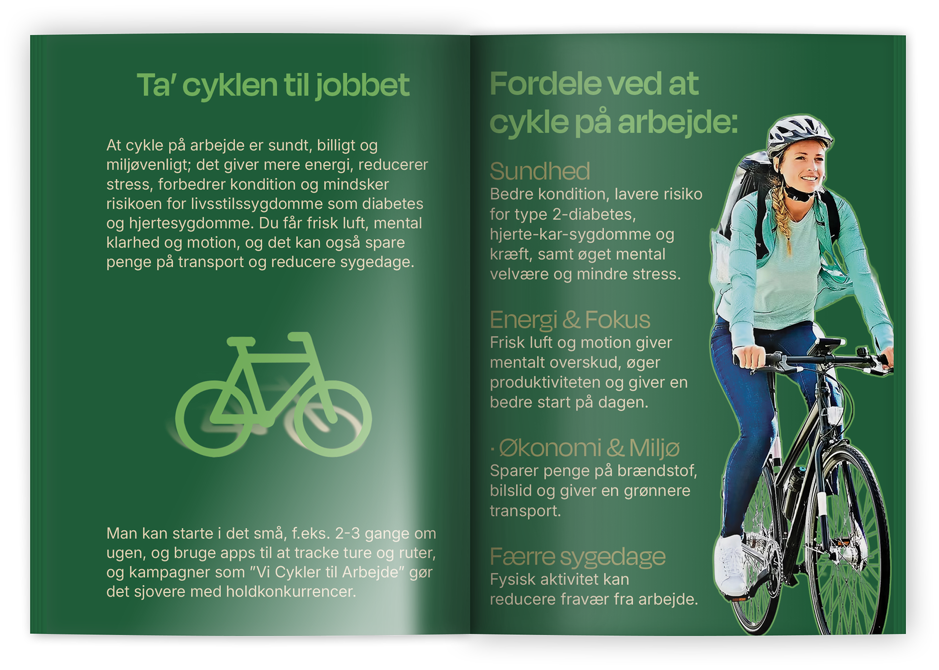
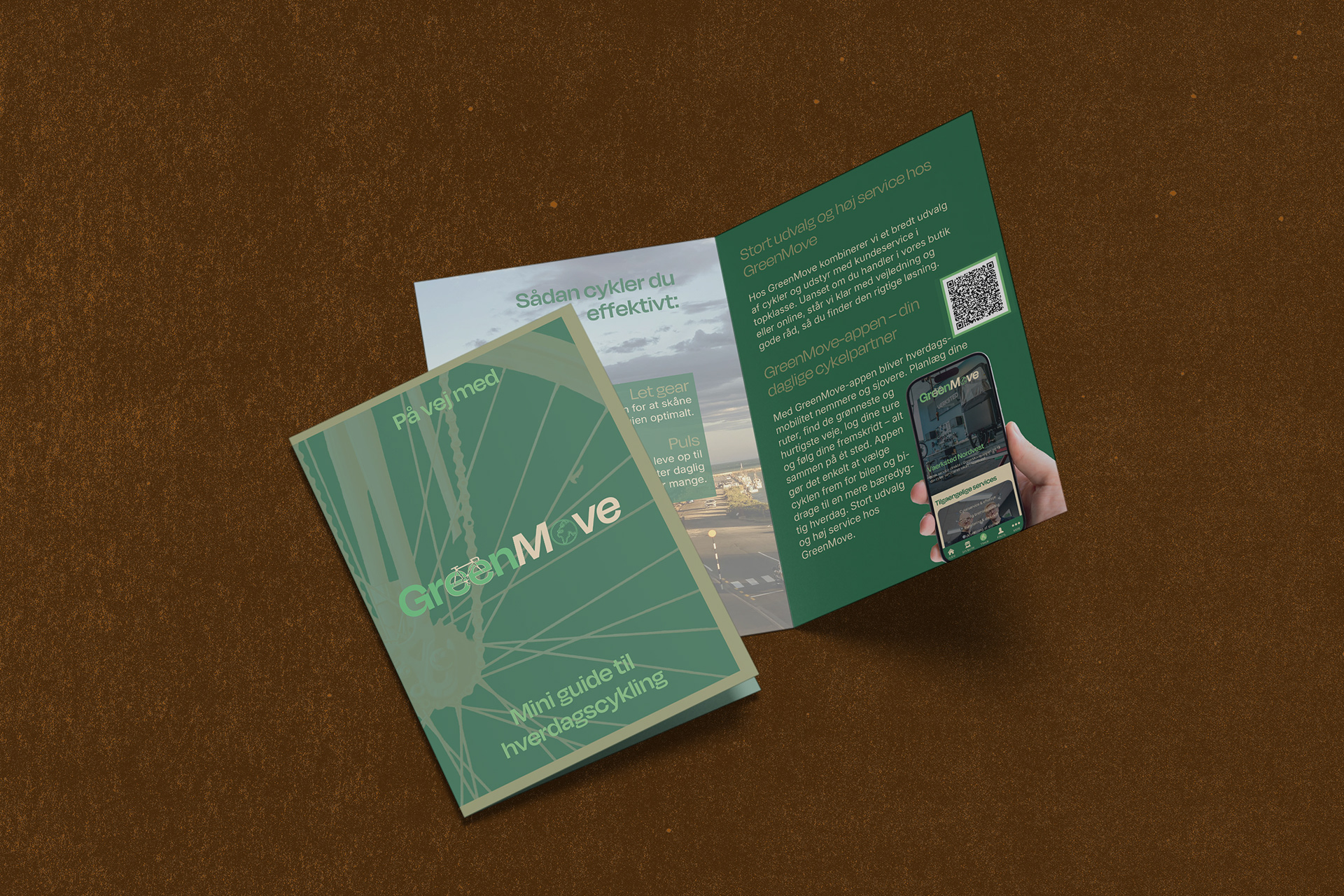
På vej med GreenMove — an 8-page guide to everyday cycling that sells nothing. Health, routes, gearing, how to start. The store appears once, at the end, with a QR to the app.
The poster recruits, the brochure teaches, the app retains.